Wednesday, September 16, 2009

Flow map


This is a Flow map. Flow maps show the movement of objects from one location to another, such as the number of people in a migration for example. In this illustration, it shows where offices will migrate to from its original headquarters.


Isoline map


This is a Isoline map. Isoline maps shows continous lines joining points of interest. This map shows lines of interest all intersecting at the south pole in Antartica.

Proportional circle map

This is a Proportional circle map. This type of map will illustrate data in relation to the size of circles. In this map, you can see that Mexicans have a higher population in Texas and California.

http://www.neiu.edu/~jrthomas/377/circle.jpg


Choropleth map


This is a Choropleth map. Choroleth maps show the distribution of a phenomenon by using shading to indicate the density per unit. Usually, the greater the density in shading will indicate the greater the density in reality. This illustration shows domestic water use in the U.S.


Dot distribution map


This is a Dot distribution map. This type of map is useful in helping to show populations. This particular map shows the concentration (population) of Aids cases in the U.S.


Hypsometric map


This is a Hypsometric map. This map will show the configuration of the earth's surface by using contous, lines, hachures, shading, tinting, or relief models. In this example you can see the contours used to express the difference in land, water, and dessert terrain.

Cadastral map


This is a Cadastral map. This type of map shows the value and ownership of land. Originally compiled for the purpose of taxation, but now serves more as a continous record of rights of land.

Thursday, September 10, 2009

Thematic map


This is a Thematic map. Thematic maps show different themes for a particular area. Themes can range from social, economic, political, etc... In this particular map, the viewer can see that British Columbia, Alberta, Nunawut, and Ontario all have increased in terms of population changes.

Planimetric map

This is a Planimetric map. Planimetric maps show horizontal distance with no relation to vertical height. These types of maps usually gives the impression that they are created on an X, Y coordinate axis. Using this type of map, the viewer can make a good guess as to how far one distance is from the other.

Topographic map

This is a topographic map of the country Brazil. Topographic maps show different levels of land elevations in terms of feet above sea levels. The map's legend illustrates the differences with color variations. You can clearly see that Chile has a higher elevation than Paraguay by their corresponding colors that relates to feet above sea level.

Friday, August 28, 2009


This is a mental map of New York burroughs, published by a student from Rutgers University. In her illustration she exibits hip hop land and also an area she describes as Kandiland.

Denver statistical map


This is a statistical map of Denver from 2001 to 2002. The map shows the levels of burglaries in the Denver area; orange representing high burglaries, and yellow low levels.


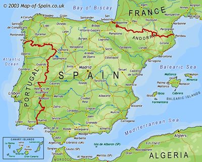
This is a World map of Spain, France, and Portugal that was published in 2003. On this map there is a clear view of the surrounding Sea's, Bay's, and Ocean's that encompass the land.

http://www.map-of-spain.co.uk/maps-of-spain/spain/map-of-spain2.jpg